
Cartography for Public Safety
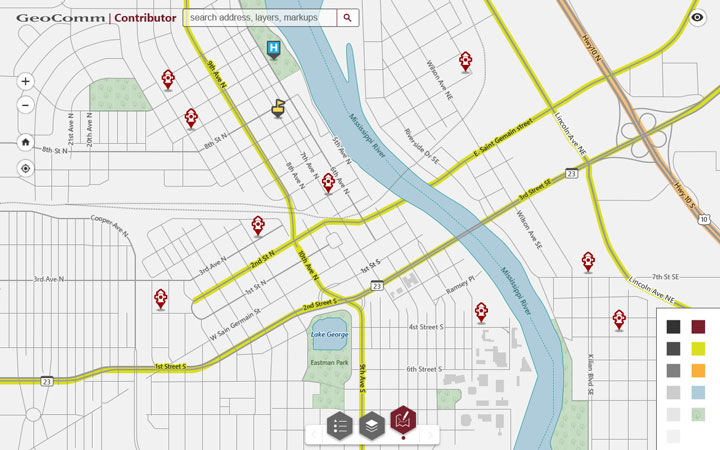
In designing a public safety map for 911 dispatchers and responders, I prioritized efficiency in locating emergencies and conveying dynamic changes. Unlike conventional maps, ours integrates custom elements such as polygons and call markers, creating intricate but potentially cluttered displays. To optimize usability, I meticulously defined contrast, tone, and color balance. Starting with an in-depth understanding of emergency processing, I developed mood boards for day and night map views, incorporating user feedback through iterative design. The final product features enhanced street and geography names with larger fonts for distant views, catering to the specific needs of dispatchers working with multiple monitors 2-3 feet away. The result is a streamlined and visually accessible tool for managing critical situations.
In response to user feedback, the day-view tone was darkened to enhance visibility in low-light environments, recognizing the unique working conditions of “911 dispatchers who work like moles.” User-controlled contrast was introduced to address vision fatigue from prolonged screen use. The map now offers intuitive features, improved navigation, and clear markup tools for dispatchers and responders. Additional design refinements were made to ensure a cohesive color scheme aligned with the client’s brand.
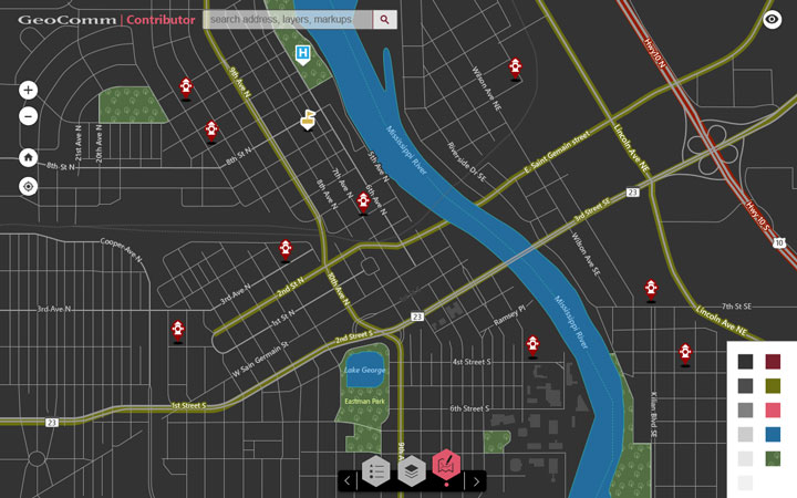
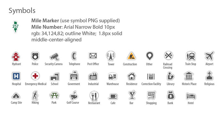
Providing clear map markers displaying emergency calls and responder locations was essential.
A standard set of PSAP map markers was created and enhanced with added floating-button depth to stand out from regular cartographic symbology.
![]()
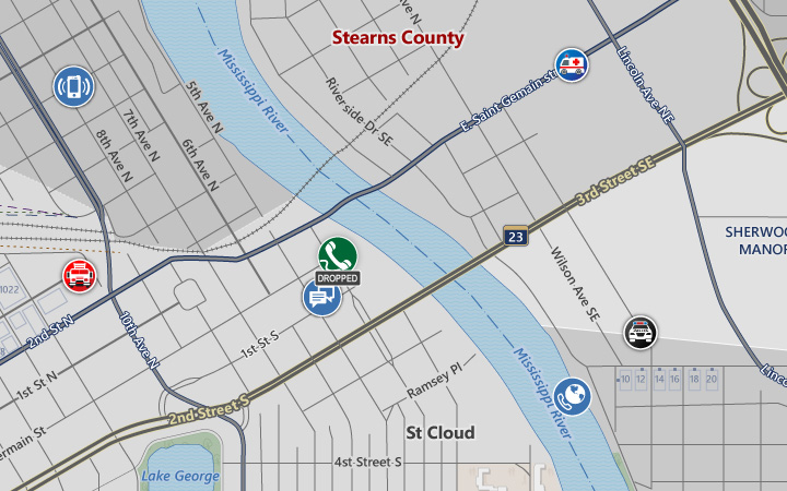
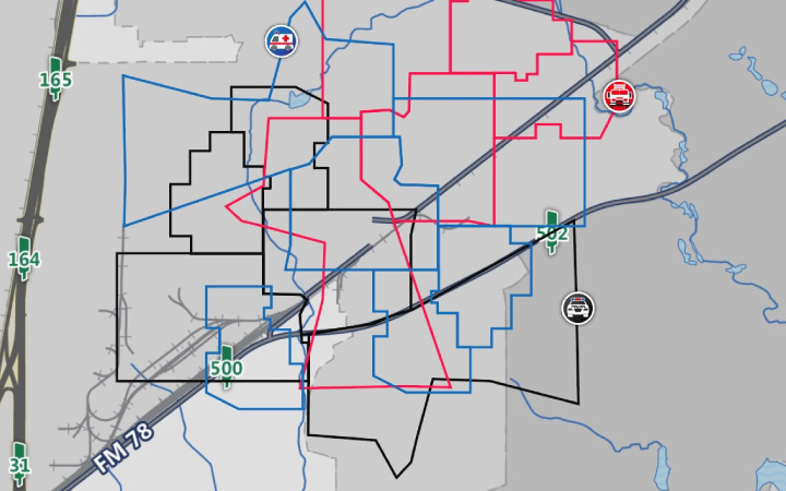
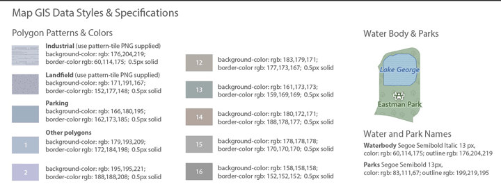
Color-coded areas of service added clarity and ease to finding ambulance police, and firefighters to respond to emergencies.
.
Provided services: user research and redefining business requirements, creating personas and journey maps, workflow chats, design of navigation, interactivity and visuals, cartography styles and symbology standards, application visual style, user interface specifications, reviews of implementation in agile cadence.
Client: Airbus Role: Design Lead